Styling form controls with CSS, revisited

Over two years ago, in September 2004, I posted an article called Styling form controls. My intention with that article (and its follow-up, Styling even more form controls) was to show that attempting to use CSS to make form controls look similar across browsers and operating systems in an exercise in futility. It simply cannot be done.

Since discussions about applying CSS to form controls continuously crop up, new versions of browsers and operating systems, and entirely new browsers have been released since September 2004, it was time for an update. In addition to that, my original articles did not include all types of form controls.

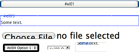
Because of all this I spent way too much time creating a total of 224 screenshots showing the effects of various CSS rules applied to form controls. The screenshots are taken from 8 browsers on 4 operating systems, for a total of 14 different browser + OS combinations.

I have created a demo page for each type of form control:

Each page contains screenshots from each of the tested platforms, as well as a set of styled form controls that you can use to check the results in browsers that I did not include. If I had unlimited time I could have included many more browser + OS combinations, but this took way longer than I anticipated anyway, so I had to draw the line somewhere.

As you may already have noted, there are no screenshots from Windows Vista. The reason is very simple: I do not have, and have no intention of investing in, a copy of it. I have no idea if form controls look any different in Vista than they do in XP. If they do, and somebody with a copy of Vista and some time to spare feels like taking a set of screenshots and sending them to me, I would appreciate it.

So what does this experiment show? Like I already stated, it shows that using CSS to style form controls to look exactly the same across browsers and platforms is impossible. It also shows that most browsers ignore many CSS properties when they are applied to form controls. In my opinion that is a good thing. Users generally expect form controls to look a certain way, so the styling of form controls is something best left to the browser and/or operating system. In fact, the current Working Draft of the CSS 2.1 Specification (3.2 UA Conformance) notes that browsers do not have to apply CSS to form controls:

CSS 2.1 does not define which properties apply to form controls and frames, or how CSS can be used to style them. User agents may apply CSS properties to these elements. Authors are recommended to treat such support as experimental. A future level of CSS may specify this further.

In other words, don’t blame the browsers for the inconsistent results.

Here are a few of my favourite weird effects that applying CSS to form controls can have:

Favourite weird styling effects

Of course this issue is not black or white. Some light and sensible styling can increase the usability and accessibility of forms. But if you choose to apply some style to your form controls, use common sense, be careful, and check the results in as many browsers as you can lay your hands on. You want to make sure your styling attempts do not make your forms hard or impossible to use.

Comments

1. January 9, 2007 by Mau

Wow!

Thanks so much for spending time on this!

It is quite useful!

2. January 9, 2007 by Gavin Laking

I agree with the light and sensible styling to improve usability and accessibility sentiment, but I think that it might be more appropriate and fruitful to style the surrounding areas. If we concentrate more on labels, descriptions of what a control does (either inline, or appearing nearby via Javascript, etc.), then encase groups of form fields in an fieldset, pile on contrasting background colours and/or text colour then we make forms sing to our visitors. And let's not forget, form fields are evil, so if you can lose a one or two, go for it. Everybody loves the guy or gal that makes life easier!

3. January 9, 2007 by Gavin Laking

Oh, and I forget to say thank you for your time and effort on these posts, they were appreciated in the past, and once again in the present!

4. January 9, 2007 by Phil Sherry

Thank you! I often point our designers to the original list, so now I'll point them to this list instead (which I'm sure they'll neglect to bookmark just as much as the old one!)

5. January 9, 2007 by Anders

I just wanted to say thank you for a great article. You've done an amazing job with the demo pages and all the screenshots.

6. January 9, 2007 by Jesper Rønn-Jensen

Thanks a lot for updating this article, Roger. Styling form controls is my first and biggest favorite of your impressive work.

A small deviation on my win xp Firefox, though. Checkbox 8 is larger (correct). On your screenshot it's small sized as if the CSS is ignored.

Compare your screenshot:

checkboxes, Roger's screenshot

to mine:

checkbox screenshot, jesper rønn-jensen, justaddwater.dk

7. January 9, 2007 by Roger Johansson

Jesper: That's odd. I double checked and my screenshot matches my Firefox 2.0.0.1 on XP. Are you perhaps using the "Windows Classic" theme?

8. January 9, 2007 by Jesper Rønn-Jensen

Roger. Yes I am using "classic" theme. To me it sounds odd that it should influence width/height definition of a checkbox.

9. January 9, 2007 by Jesper Rønn-Jensen

Just for the record, I get the same result as you when I change theme to "Windows XP Style"

10. January 9, 2007 by Nate K

Roger, thanks for the exhaustive list! I was just looking at the original post regarding form controls while reading through 'HTML Mastery' - this is a nice update to that list!

11. January 9, 2007 by chris

this is absolutely amazing.

12. January 9, 2007 by Riddle

Checkbox No.8 is small on my platform (Fx 2.0.0.1, WinXPSP2, XP Styles turned on) and looks the same as on Roger's screenshot.

13. January 9, 2007 by Edward Delaporte

For anyone here who just desperately needs to get form control functions without sacrificing control or style; PHP 5 allows on-the-fly creation of form-element like images in whatever flavor you please.

The O'Reilly book, PHP: In a Nutshell has a very nice walkthrough on this subject.

Unfortunately, it's a trick limited to buttons (and check-boxes for the clever AJAX user). And it has the potential to become an accessibility nightmare.

14. January 9, 2007 by Johan

Why even try to style them? Font, size, margins and padding are the only things I style and it works super.

15. January 9, 2007 by Dan Boland

Thanks for this impressive, useful list!

16. January 9, 2007 by Mark Rowe

Your list includes "WebKit 420+" -- which revision of WebKit did you create your screenshots with? All builds over the last 9+ months have featured the 420+ version number, and support for styleable form controls has improved dramatically in that time frame. It'd be great to have some idea how recent a version is needed to produce results matching your screenshots.

17. January 10, 2007 by Nick Presta

Very comprehensive list! Thanks for the information.

If only browsers handled these things in a more uniform fashion, life would be easier. :)

18. January 10, 2007 by Christopher Schmitt

For my second edition of the CSS Cookbook, I compiled an Appendix listing the form elements, certain CSS properties and 10 different browsers. It's over 160+ pages long and I hope it compliments your work.

No one needs to buy the book to get the appendix as O'Reilly is gracious enough to give it away. It's free for download at http://www.oreilly.com/catalog/cssckbk2/appendixd/appd.pdf

19. January 10, 2007 by Roger Johansson

Mark: WebKit 420+ is the only version information I can find. Where do I find out exactly which build I am using? Or is it the number that appears in the query string of the URL that loads when you launch a nightly build? In that case, the screenshots were taken with revision 18654.

Christopher: Wow, that is a seriously thorough compilation of form element screenshots! Thanks for posting the URL!

20. January 10, 2007 by Marco Pegoraro

Hi, I think your work is fine.

May be better using classes instead of id for your controls?

21. January 10, 2007 by Vlado

From my experience using padding with form controls is hell. And perharps under various doctypes the elements behaviour varies, but the screenshot of input with type "text" and padding is not what I've been experienced lately.

22. January 10, 2007 by Niels

Interesting read, although it kind of passes along my main interest when it comes to form elements.

Not so much the styling of the elements themselves is important I think (like you said, people recognize form controls as form controls because they look like form controls), but the placement and dimensions are my main concern.

What gives me headaches is the margins around elements. The fact that in some browsers a button is 1 or two pixels higher than in other browsers. Or wider.

Maybe it's because I'm not a big fan of the Web 2.0 look (let's cover all inconsistencies with white-space!), but I like at least be able to make a pixel perfect design. Things like that become quite tricky when you want to float a small search form next to a breadcrumb and keep the heights of both elements the same cross-browser. Or simple aligning labels with form elements, cross-browser.

23. January 10, 2007 by Andy

Johan @ 14: Why try to style them? Because clients tell you to...

Roger, thank you for the work you've done on this - I've been a frequent visitor to your previous posts on this subject and appreciate the update.

24. January 10, 2007 by Ramon Bispo

Wow! Good!

Nice job, Roger!

Thanks for sharing!

25. January 10, 2007 by Mathieu M-Gosselin

Nicely done!

Although I don't have Vista, I read in the changelog that they fixed the bug with large buttons that cause border pixelization in IE (as seen on your screenshots).

26. January 10, 2007 by Alex Burr

Roger, not to kiss your butt or anything, but this article is a serious contender for Best Thing Anyone's Written Ever.

Anyone that has ever developed web applications or sites in any sort of corporate environment can attest: there are QA departments that turn in reports which are less than half as thorough as this article.

Excellent!

27. January 10, 2007 by Chris G.

Thanks, Roger. Very useful!

Related: CSS-Based Forms: Modern Solutions

28. January 10, 2007 by Miles

Thanks for this good info, adding your site to delicious and Google reader because of this article :)

29. January 10, 2007 by Roger Johansson

May be better using classes instead of id for your controls?

In what way would that be better? Are you thinking of a production environment where an identically styled control may appear multiple times on the same page? If so, then yes, in that case using classes would be better.

the screenshot of input with type "text" and padding is not what I've been experienced lately

How are they different?

I read in the changelog that they fixed the bug with large buttons that cause border pixelization in IE

That's good. Those buttons are really ugly ;-).

30. January 11, 2007 by Drukwerk

Roger, thanx for spending so much time on this complete list. From experience I know testing is pretty important and sometimes you just run into some weird side effects when styling your form, for example in Firefox under Linux.

31. January 11, 2007 by Daniel Larsson

Nice job Roger. Very interesting.

It´s always nice to know if a web application works and what it looks like in a bunch of browsers/platforms.

What setup of computer(s) and operating systems did you use when taking all the screenshots? Several operating systems on the same machine? How many times did you have to reboot? How long did it take?

Do you have any tips on what setup to use when testing a web application (functionality and design) that is supposed to work "for the most users on the web"? What if the web application contains both HTML, CSS and Javascript? How do you run tests to be able to guarantee that it looks almost the same and works fine on all systems?

32. January 11, 2007 by Matthew Pettitt

The thing that annoys me all the time is that text boxes and select boxes always seem to treat widths differently: set them to the same class, and apply, say, "width:100px" to them, and they aren't the same size! If different elements can't even be styled by the same browser to be the same size, what hope is there for anything else?

33. January 12, 2007 by Christopher Schmitt

@Roger: Thanks. It took a lot of time to assemble and put together. Over 1,600 screenshots :)

34. January 12, 2007 by Roger Johansson

What setup of computer(s) and operating systems did you use when taking all the screenshots? Several operating systems on the same machine?

MacBook Pro + Parallels Desktop. 4 different virtual machines: XP IE 6, XP IE 7, Ubuntu, Kubuntu.

How many times did you have to reboot?

None.

How long did it take?

A couple of days.

35. January 15, 2007 by Renato Targa

I agree theses captures are a great value for designers and developers (and a time consuming work, wow!). It helps to understand and predict the way some browsers/OS combinations will render the code.

As a matter of fact, for a usability point of view, I wonder if styling form fields are of great value for users due to cognitive friction (specially if the specifications let the user agents free to implement the look and fell they think is more appropriate to each environment). Wouldn't they be better served if they recognize (human brain is great for pattern recognition, not thinking...) the same basic fields from their OS or browser?

36. January 16, 2007 by Roger Johansson

Wouldn't they be better served if they recognize (human brain is great for pattern recognition, not thinking...) the same basic fields from their OS or browser?

Yes, I believe so. Unfortunately, many visual designers tend to value "branding" above user experience. By doing this I hope I can show that trying to style form fields to achieve "branding" or "visual consistency" is a waste of time.

37. January 23, 2007 by tobto

Roger, thx for usefull info! In fact all webmasters all over the world use forms, but a few spent their time to check their abilities.

38. January 31, 2007 by Rez
Like I already stated, it shows that using CSS to style form controls to look exactly the same across browsers and platforms is impossible.

Using CSS to style complete websites to look exactly the same across browsers and platforms is impossible, but this hasn't yet stopped us from using CSS to build websites that are most commonly viewed on the browser that is the least CSS compliant, has it?

Users generally expect form controls to look a certain way, so the styling of form controls is something best left to the browser and/or operating system.

Yes, in fact, don't you all think our users would be so much better off should the appearance of main navigation was also controlled by the browser and/or OS? Imagine all those users who struggle day in, day out, negotiating their way through navigation systems that look and work so different one from the other. The web would be a utopian place for our users if browsers provided set navigation controls, naturally with strict positioning, only allowing us to add labels and a href attributes.

Excuse the facetious sentiment – you can tell I'm a designer and not the developer who has to deal with my aspirations for visual consistency.

Internet users are not stupid. Give them the benefit of the doubt or undertake usability testing. Visual coherence and consistency is required not just to satisfy the whims of the brand managers or the egocentric designer – humans are drawn to visual stimuli, they like seeing non-system buttons when these contribute to the visual coherence of the website.

Not making any attempt to style form-controls, just because perfection is impossible to achieve is a poor excuse. If you know that 80% of your users use IE, you can ensure that 80% of your users will have a better visual experience. Most clients are reasonable and would understand that perfection in this matter is unachievable.

39. February 9, 2007 by Chris

I just wanted to say that I set Opera on Windows to use the OS theme, so my buttons and forms look more like Firefox.

Padding on buttons can differ a lot between browsers. I made a table of screenshots myself, which people might find useful.

I also detailed the IE stretched button effect and what causes it.

40. March 5, 2007 by Henrik

Well said Rez. I love Rogers work, but at times the preaching gets a bit like over the top.

41. March 5, 2007 by Roger Johansson

Rez: You're missing the point.

Not making any attempt to style form-controls, just because perfection is impossible to achieve is a poor excuse.

How so? If failed attempts at styling for instance buttons lead to them being harder to use for some people (us Safari users are often discriminated against in this matter), why should you? Do you really believe that users in general prefer to have your "visual consistency" imposed on them (or even care about it)? Come on now, you can design the rest of the page as much as you want, but be very careful when it comes to form controls, and make damn sure to check the results in every single browser you can find.

Henrik: Preaching? I'm just telling it like it is.

42. March 18, 2007 by John Manoogian III (jm3)

Wow. This is totally insane, and very helpful. Thank you!

43. July 4, 2007 by Tom K

Great article. As a designer, I'm surprised by how many negative comments were made here. The bottom line for a designer is that if you can't make it look great AND work great, then you need to make it work great first.

44. July 12, 2007 by thinsoldier

who wants to start working on the definitions of pseudo elements for accessing the sub-parts of form elements and scrollbars so that they can be styled with the same amount of flexibility as a div?

Should be able to finishe writing it in 5 years and then it's just a 15 year wait for it to be implemented.

For example. It could be possible to make the konqueror file input's "browse" button actually say browse by selecting

input[file]::browseButton:inside { content:'Browse'; background: #eee; color: #fff; }

input[file]::filepath

select::selectedbox

select::dropdownbox

select::arrowbox

div {height:300px; overflow:auto}

div::scrollbar::track

div:: scrollbar::scrollhandle

/* for vertical scrolling */

div::scrollbar::scrollhandleNorth

div::scrollbar::scrollhandleSouth

div::scrollbar::northarrow

div::scrollbar::southarrow

/* for horizontal scrolling */

div::scrollbar::scrollhandleEast

div::scrollbar::scrollhandleWest

div::scrollbar::eastarrow

div::scrollbar::westarrow

Remember the hundreds of templates that mock the look of apple's Aqua that were used by thousands of people who've never even used a mac. With these pseudo elements making all the parts as styleable as divs and multiple background images, they could have made any form element or scrolling div on their site look just the OS X appearance in All Browsers on all OS's.

Which is more important for your site or Web APPLICATION?

Cross Platform Consistency

Consistency with the host OS

Sorry, comments are closed for this post.

Information, sponsorship, and externals

About the author

Roger Johansson is a Swedish web professional specialising in web standards, accessibility, and usability. More about me and this site.

Subscribe

Looking for web hosting?

Try DreamHost!

Use the promo code 456BEREASTREET3 to save USD 20 when you sign up!

Latest articles

Validation statistics from Nikita the Spider Comments off
An analysis of the sites crawled by the bulk validation tool Nikita the Spider during March 2008.
Authentic Jobs API and Affiliates program Comments off
The Authentic Jobs job listing service now has a public API and an affiliate program.
What does Acid3 mean to you and me? Comments off
Opera and Apple have announced that their web browsers pass the Acid3 Browser Test, but how will that help web designers and developers?
Designing Web Navigation (Book review) Comments off
Learn the fundamentals of navigation design and design better navigation systems for large and small sites as well as for web based applications.
DOMAssistant bundle for TextMate Comments off
To save keystrokes and speed up development I have created a DOMAssistant bundle for TextMate.
First impressions of Internet Explorer 8 Beta 1 Comments off
My impressions after trying out Internet Explorer 8 Beta 1 for a couple of days.

More articles

Favourites, here and elsewhere

Affiliation

  • NetRelations
  • Kaffesnobben
  • Dagens recept
  • 9rules network member

Support this site

Show your support by buying a book or two from SitePoint or getting me something from my Amazon Wish List.