Styling even more form controls
This is a follow-up to my previous post about Styling form controls. For some background info and comments, you may want to read that post. In short, this is a reference that shows how differently form controls are rendered by different web browsers and operating systems. It also shows that little can be done to make form controls appear the same across browsers and platforms.
I’ve taken screenshots of the form controls that were not included in the original post, as well as the disabled state of all controls. There is still more that could be added, since you could try styling form controls in many more ways than I have done here. The result would be the same, though: cross-platform styling is not possible with CSS. And that’s a good thing, in my opinion.
There are a lot of form controls that can be used in an HTML form. For this exercise, I applied styling to the button (<button>), the submit button (<input type="submit" />), the menu, a.k.a. the select box (<select>) in single and multiple modes, the single line text input (<input type="text" />), the checkbox (<input type="checkbox" />), the radio button (<input type="radio" />), the multi-line text input (<textarea>), and the file select control (<input type="file" />).
I created a simple document for each control, containing twelve controls of the same kind, and one document with disabled versions of each control. Then I created a different CSS rule for each element. Due to the various controls having different properties to style, I made a few slightly different sets of rules.
The following rules were applied to buttons, submit buttons, select boxes, single line text inputs, multi-line text inputs, and file select controls:
#el01 {color:#00f;}
#el02 {background-color:#ddd;}
#el03 {color:#fff; background-color:#33b;}
#el04 {border-width:4px;}
#el05 {border-color:#00f;}
#el06 {border:0;}
#el07 {font-family:"Courier New", Courier;}
#el08 {font-size:150%;}
#el09 {font-size:10%;}
#el10 {font-weight:bold;}
#el11 {padding:0;}
#el12 {margin:0; text-align:right;}
For the select boxes, buttons, and submit buttons I changed the last rule a bit to make sure any effect of text-align is visible:
#el12 {margin:0; text-align:right; width:10em;}Checkboxes and radio buttons were styled with these rules:
#el01 {color:#00f;}
#el02 {background-color:#ddd;}
#el03 {color:#fff; background-color:#33b;}
#el04 {color:#fff; background-color:#33b;}
#el05 {border-width:4px;}
#el06 {border-color:#00f;}
#el07 {border:2px solid #999;}
#el08 {width:40px; height:40px;}
#el09 {font-size:150%;}
#el10 {font-size:10%;}
#el11 {padding:0;}
#el12 {margin:0;}
I kept the styling very basic in order to clearly show the effect each rule has on styling in the various browsers. There are of course many more styles that could be added, like width, height, background images, and different border styles. When the rules were set up, I loaded the documents in the following browsers:
- Camino
- Firefox 1.0 PR Mac
- Firefox 1.0 PR Win
- IE 5 Mac
- IE 6 Win
- Opera 7.53 Mac
- Opera 7.53 Win
- Safari
All Mac browsers were running on Mac OS X 10.3.5, and all Windows browsers were tested in Windows 2000 and Windows XP. By default, this is what the various controls look like in each of the tested browsers:
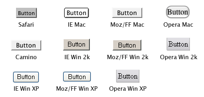
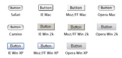
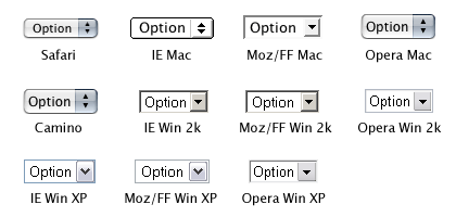
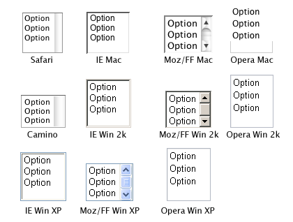
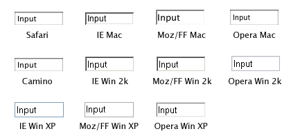
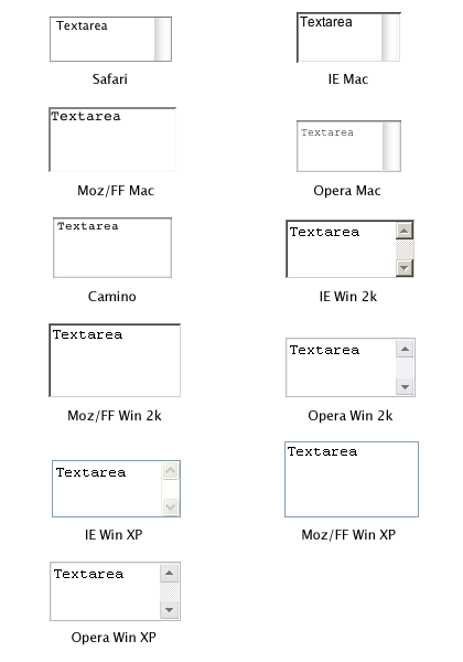
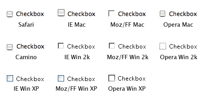
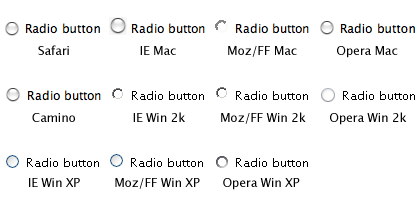
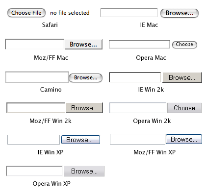
As you can tell, the default look of these form controls varies a lot between browsers and operating systems. And I haven’t even added any browsers running on Mac OS 9 or Linux to the mix.
The screenshots of the styled form controls are too large to include in this post, so they are available in separate documents:
- Styled buttons
- Styled submit buttons
- Styled select boxes (single)
- Styled select boxes (multiple)
- Styled single line text inputs
- Styled multi-line text inputs
- Styled checkboxes
- Styled radio buttons
- Styled file select controls
- Disabled controls (default styling)
The documents also contain the CSS and XHTML used, so you can check what styling the browser you are using applies to these controls.
As the screen shots show, very little styling is applied the same way in every browser.
In conclusion: trying to style form controls to look the same across platforms is often a waste of time. Leave them to the browser/operating system defaults, or do only very light styling. That way you will save yourself and your site’s visitors a lot of frustration.
Update: This article is more or less obsolete. Please refer to Styling form controls with CSS, revisited for a more up-to-date look at CSS applied to form controls.
- Previous post: Safari and XHTML
- Next post: Document titles and title separators