Internet Explorer and the CSS box model
One of the differences between Internet Explorer and standards compliant Web browsers that cause a lot of trouble for CSS beginners is the CSS box model. Since the box model is what browsers use to calculate an element’s total width and height, it is quite understandable that different browsers producing different results can be both confusing and frustrating.
How the CSS box model works has been explained by others many times already. Nonetheless I still see questions related to the CSS box model on forums and mailing lists, and frequently encounter sites that expect browsers to use Internet Explorer’s non-standard way of calculating box dimensions. That is why I have written this article, which to a large extent is a translation of an article I wrote for Swedish magazine CAP&Design earlier this year.
If you already know how the different box models work and how to handle Internet Explorer, there is nothing new for you here. If you get different box dimensions in IE and other browsers without knowing why, keep reading.
The CSS box model diagram
Here is a simple diagram showing how the dimensions of an element are related in CSS:
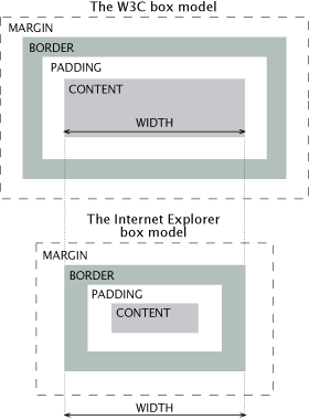
For the purposes of this article, all browsers handle the margin property the same way when calculating an element’s total width, so I’ll be concentrating on the padding and border properties.
The W3C Box model
First a look at the the W3C box model, which is used by all standards compliant browsers and by Internet Explorer 6 and later if the circumstances are right. In the W3C CSS box model a block level element’s total width is calculated using the following formula:
total width = margin-left + border-left + padding-left + width + padding-right + border-right + margin-right
The same concept applies to height, but for the sake of simplicity I will only talk about width from now on.
The IE Box model
The IE Box model is similar except for one important difference: paddings and borders are not included in the calculation:
total width = margin-left + width + margin-right
This means that if the element also has horizontal padding and/or borders, the actual content area will shrink to make room for them.
IE versions
Versions 5.5 and earlier of Internet Explorer for Windows always use the IE Box model. What many do not seem to be aware of is that IE 6 and later use the W3C box model when in standards compliant mode. This is a good thing since it means that problems will only occur in IE/Win 5.5 and older, provided that you use a DOCTYPE that makes IE use standards compliant mode.
Attacking the problem
By making sure that IE 6 is in standards compliant mode, you only have to care about this whole thing if you still are concerned about your sites looking the same in IE 5.*/Win as in more recent browsers. If that includes you there are several ways of attacking the problem, listed here in my order of preference:
- Avoid situations that cause problems
- Insert extra markup
- Use conditional comments
- Use CSS hacks
Since the problems caused by the Box model differences are often only cosmetic, my personal preference is to simply not bother with IE 5.*/Win. Sometimes that isn’t acceptable and I have to use one of the methods I’ll describe here.
1. Avoid situations that cause problems
This is how I prefer to solve the problem. I simply avoid specifying both width and padding or border for the same element. This ensures that all browsers will use the same total width, no matter which box model they use.
Let me use an example to illustrate. The HTML used to mark up a list of news articles could look like this (simplified):
<div id="news">
	<h2>News</h2>
	<ul>
		<li>
		<h3>News article 1</h3>
		<p>Lorem ipsum dolor sit amet</p>
		</li>
		<li>
		<h3>News article 2</h3>
		<p>Lorem ipsum dolor sit amet</p>
		</li>
	</ul>
</div>
To make the list 250 pixels wide with a one pixel border and 10 pixels of padding, you could use the following CSS:
#news {
	padding:10px;
	border:1px solid;
	width:228px;
}
In standards compliant browsers, the total width will be 250 pixels (1px left border + 10px left padding + width + 10px right padding + 1px right border). In IE 5.5 and earlier, the total width will be 228 pixels since it doesn’t add paddings and borders.
So how can you avoid this? Let’s assume that the news list is in another container, for instance a sidebar:
<div id="sidebar">
	<div id="news">
	...
	</div>
</div>
If that is the case you can set the width on that container instead:
#sidebar {width:250px}
#news {
	padding:10px;
	border:1px solid;
}
Since #news is a block level element it will automatically fill the entire width of its parent element, which in this case is #sidebar.
2. Insert extra markup
If you can’t use method 1, another method is to insert extra markup. Using the same example as previously, assume that #news is not supposed to expand to the full width of #sidebar. Specifying a width for #news to prevent that is a the scenario you want to avoid. A workaround is to change the markup to this:
<div id="news">
	<div>
		<h2>News</h2>
		<ul>
		...
		</ul>
	</div>
</div>
and use the following CSS:
#news {width:250px}
#news div {
	padding:10px;
	border:1px solid;
}
The outer element controls the width, and the inner element contains the border and padding.
It’s up to you to decide whether it is a reasonable compromise to add extra markup like this. It is obviously better if you can avoid doing so, but an extra div element doesn’t cause any other problems than increased file size and slightly reduced markup maintainability. It does not affect accessibility or how the document is presented with CSS off. Besides, having an extra element is necessary to create certain designs, so you may already have the markup you need.
3. Use conditional comments
If there is no suitable element that can be used to control the width and you can’t or won’t add extra markup, IE 5.*/Win needs to get a different value for width.
In my opinion, the safest way of doing that is to use conditional comments, which are comments whose content is only visible to IE/Win. In this case only IE below version 6 are supposed to get the contents:
<!--[if lt IE 6]>
<style type="text/css">
	#news {width:250px}
</style>
<![endif]-->
If you choose to use this method I recommend moving all IE 5.*/Win specific CSS to a separate file and load it like this:
<!--[if lt IE 6]>
<link rel="stylesheet" type="text/css" href="/css/ie5.css">
<![endif]-->
This is a safe way of ensuring that only the browsers that need the modified CSS see those rules.
4. Use CSS hacks
Finally you can also use a CSS hack to supply modified values to IE 5.*/Win. I recommend avoiding CSS hacks as much as possible. Just like the name implies, these are hacks, and hacks that are based on undocumented errors in different browsers’ CSS parsing. Since many people still use CSS hacks I’m mentioning it anyway. I highly recommend that you consider other options before using them unless you know exactly what you are doing.
The simplest CSS hack for working around box model problems is The simplified box model hack, SBMH. Provided that the HTML is the same as in the first example, the CSS would look like this:
#news {
	padding:10px;
	border:1px solid;
	width:250px;
	w\idth:228px;
}
All browsers see and understand width:250px. IE 5.*/Win does not understand the next line, w\idth:228px, which all standards compliant browsers do. The result is that width is set to 250px in IE 5.*/Win and 228px standards compliant browsers, giving the list the same total width in all browsers.
Conclusion
As I have shown here it is possible to avoid or work around the problems caused by the different CSS box models. Which method you use will depend on the circumstances.
I should also mention that some time in the distant future, the CSS 3 box-sizing property will let you choose which CSS box model you want browsers to use. The W3C box model is called content-box and the Internet Explorer box model is called border-box. Being able to control this in all browsers is a good thing since each model has its pros and cons. However, browser support is currently too limited for this property to be of any practical use.
Hopefully none of this will be necessary in a couple of years. IE 7 was released in October 2006, and for every day fewer and fewer use the older versions of IE. It is already acceptable for some sites to hide all CSS from IE/5.* or to simply not care about the rendering differences.
I’ll leave it to you to decide when you can start hiding CSS from IE 5.*/Win.
- Previous post: Forget WYSIWYG editors—use WYSIWYM instead
- Next post: Styling form controls with CSS, revisited