Customising custom corners and borders
The technique for creating a flexible box with Transparent custom corners and borders that I described here in mid May became quite popular. I have updated the technique to fix most of the glitches pointed out in the comments to the original post, and it should be pretty solid now.
One question that I’ve been getting is how to replace the images the demo uses for the borders and corners. It isn’t very complicated, but I realise it can seem that way at first, and since I’ve been getting questions about it I thought I’d explain exactly how to replace my demo images with your own.
Here’s a diagram (at twice the original size) that shows the distances you need to measure in your image:
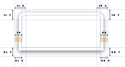
The heights of the top left and top right corners need to be equal. The same goes for the bottom left and bottom right corners. So TL Y = TR Y and BL Y = BR Y.
The complete box image should be as wide as you want the box to stretch to before it starts breaking. In the demo I made it 1600px wide.
The border image is created by combining the shaded areas below “LB” and “RB”. The left part goes to the left and the right part goes to the right. The height doesn’t matter, but make it at least a few pixels tall to reduce the number of times the browser needs to repeat it vertically.
The CSS affected is the following, with the measurements from the diagram used instead of actual values:
/* Top border and right corner */
.bt {
	background:url(box.png) no-repeat 100% 0;
	margin:0 0 0 TL Xpx;
	height:TL Y/TR Ypx;
}
/* Top left corner */
.bt div {
	height:TL Y/TR Ypx;
	width:TL Xpx;
	position:relative;
	left:-TL Xpx;
	background:url(box.png) no-repeat 0 0;
}
/* Bottom border and right corner */
.bb {
	background:url(box.png) no-repeat 100% 100%;
	margin:0 0 0 BL Xpx;
	height:BL Y/BR Ypx;
}
/* Bottom left corner */
.bb div {
	height:BL Y/BR Ypx;
	width:BL Xpx;
	position:relative;
	left:-BL Xpx;
	background:url(box.png) no-repeat 0 100%;
}
/* Left border */
.i1 {
	padding:0 0 0 LBpx;
	background:url(borders.png) repeat-y 0 0;
}
/* Right border */
.i2 {
	padding:0 RBpx 0 0;
	background:url(borders.png) repeat-y 100% 0;
}
While I was writing these instructions I made a quick customised demo to make sure the instructions actually work.
To make your own custom corners and borders you need to do the following:
- Create your box in Photoshop, Fireworks or whatever your favourite image editing application is
- Save one image with a complete box and one with just the borders
- Measure the distances shown in the diagram
- Enter the values into the CSS
I hope this makes customisation easier.
- Previous post: Safari Wishlist
- Next post: HTML tags vs. elements vs. attributes